Ten Design Tips to Transform Your Projects
We all know the elements and principles of design can help create masterpieces in our scrapbook layouts. But sometimes, knowing how to use and combine them to make a cohesive, visually pleasing layout is easier said than done. The teachers at BPC have come together to provide ten helpful design tips to try out on your next project! Learn how emphasis can create a focal point with Meghann Andrew in Principle Power. Bring unity to your page by utilizing repetition with Magdalena Hanéll in Pocket Page Design. And discover how proportion can affect the whole look of a page with Michelle Wedertz in Recycled Page Designs. Try out these design tips and more to transform your page!

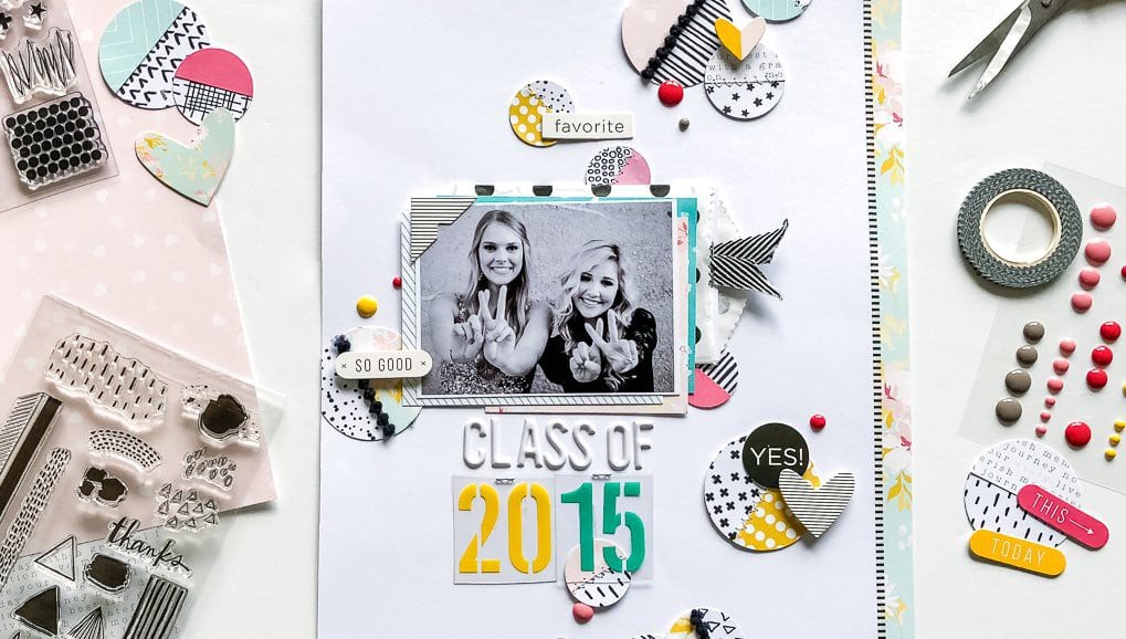
Create a focal point with emphasis.
Principle Power, Meghann Andrew
Emphasis creates a focal point in design; it's the way we show the viewer what's most important. It's the starting point in the viewer's journey around your layout, a journey that you manipulate—not by words, but by design. That's some pretty powerful stuff! Emphasis is created by either contrast or placement. Remember, contrast is the juxtaposition of differences that attracts your eye, which is the main idea behind emphasis. You want whatever is most important on your project to attract the viewer's eye first; so, naturally, emphasis and contrast go hand in hand. Also, keep in mind that any of the elements of design (line, shape, color, texture, or value) can be contrasted. However, you can also create contrast with orientation, style, and size.

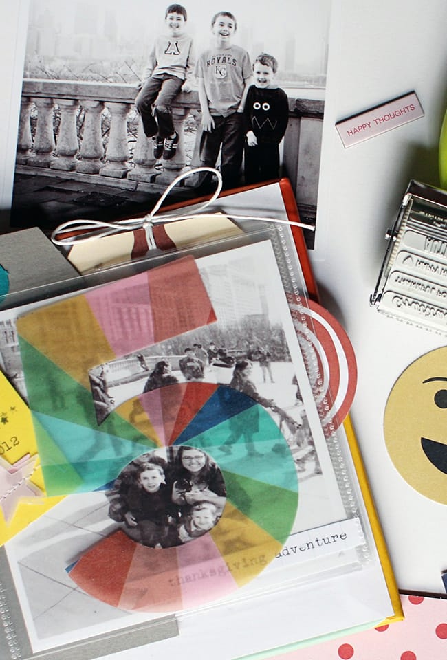
Bring a sense of unity to your page with repetition.
Pocket Page Design, Madelena Hanéll
The principle of repetition simply means the re-using of the same or similar elements throughout your design (for example, shapes, colors, or lines). Repetition brings a sense of unity, consistency, and cohesiveness to your page. Repetition can be regular or irregular and even or uneven. It also works to make the design seem active. When repetition is used, your eye tends to travel around the whole page.

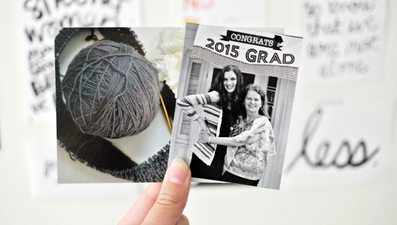
Experiment with proportion for a different look.
Recycled Page Designs, Michelle Wedertz
Changing up a layout design doesn’t have to be complicated. By simply changing the dimensions or size of a design, you can get a whole new look. Here, I decided to play with the proportions of the patterned paper by shrinking my elements and making them all cozy with one another. I could have also gone the exact opposite and jumbo-sized my design by completely filling the page with photos and paper.

Incorporate shapes into your background design.
In the Background, Ashley Horton
As memory keepers, we want our photos to stand out on our layouts, but that doesn't mean we have to have bland, boring backgrounds. Whether you're using hand-cut techniques or die-cut techniques, there are a lot of fun options for your background designs. And, it's always fun to take basic shapes and turn them into something spectacular! So, don't let your design fade into the background.

Let color tell the story.
Color Play, Leanne Allinson
Color can determine mood and draw attention to important details of the memory. Color is such a powerful way to convey emotion. A tone-on-tone effect can be very welcome if you want to portray a calming environment. I often take cues from my photos and this layout is no different.

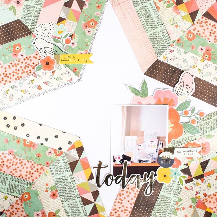
Create a visually interesting pattern.
Paige's Pages | 04, Paige Evans
Make one row, or fill up the page! Chevrons make fun borders and design elements on your pages and projects! Plus, they’re pretty easy to make with the help of a square punch or paper cutter.

Use lines to create a visual triangle on your page.
Line It Up, Becki Adams
I’m sure you’ve probably heard of the “visual triangle” design principle. A visual triangle is basically three lines intersecting. Creating a visual triangle is so easy and fun! This layout has three embellishment clusters to keep your eye moving around the page. Two of the embellishment clusters are above the photo and one is below. The photo, journaling, and title all fall on one (or more) of the three lines on the layout.

Incorporate negative space in your photos.
Inspired Everyday Photography, Carly Robertson
Another composition principle—and one I use a lot—is negative space. The negative space method is when you surround your subject with what is sometimes referred to as “white space” or “blank space.” Using negative space is a great way to draw attention specifically to your subject. My favorite effect when using negative space is the clean and simple images you are able to achieve. Using the negative space composition method can produce a variety of results, ranging from subtle images to those that jump off the page.

Add texture to your project.
Mixed Media Texture, Zinia Amoiridou
I believe that when we talk about texture, the first thing that comes to most people’s mind is texture paste. There are a bunch of different pastes and gels on the market that give different effects and all of them are really fun to play with.

Achieve balance by starting with a sketch.
Start with a Sketch, Jen Chapin
I've been scrapbooking for a long time, and there are still times I get stumped on where to start out when I'm making a layout. Sketches are my number one starting point when I need to create and am short on inspiration. Starting with a sketch takes a lot of the mental work out of creating a layout, and you're free to use the patterns and colors that will express your theme. It also allows you to play with product that you may have been hoarding for awhile!
Are you feeling inspired to apply these design tips to your next project? Grab your supplies and then come join the BPC teachers in the classroom to start incorporating design techniques into your projects today! Remember, as a member of Big Picture Classes, you get access to our entire library of classes. Sign up now and start exploring!


Sign in or sign up to comment.
0 comments